
Page 16 - Bar Graphs
P. 16
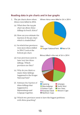
Reading data in pie charts and in bar graphs


               1. The pie charts show where          Where rhinos were killed in sA in 2014
                   rhinos were killed in 2014.
                   (a) What does the top pie
                       chart say about rhino
                       killings in South Africa?


                   (b) How can you estimate the
                       fraction of the pie chart
                       which is shaded blue?


                   (c) In which four provinces       Key:
                       were most rhinos killed          Kruger national Park      rest of sA
                       in 2014? Look at the
                       bottom pie chart.

                                                     rhinos killed in the rest of sA in 2014
                   (d) Four provinces seem to
                       have very few rhino
                       killings. Which
                       provinces are they?


                   (e) Why do you think so
                       many rhino killings
                       happened in the Kruger
                       National Park?


                                                     Key:
                   (f) Estimate the fraction of         Gauteng            limpopo
                       rhino killings that              mpumalanga         north West
                       happened in                      eastern Cape       Free state
                       Mpumalanga and                   KwaZulu-natal      Western Cape
                       Limpopo together.                northern Cape


                   (g) Which two provinces seem to have the biggest problems
                       with rhino poaching?


                                                   15